Love is in the air as Stampin’ Up!’s yearly party starts today and you could choose the “Most Adored” SPECIALTY Designer Series Paper as a free product (with $50 purchase) to complete some elegant Valentines in Real Red and Shiny Gold:
Paired with the Sale-a-Bration “Heartfelt Hellos” stamp set, the gold-foiled stars shimmer!
This sketch would work with any Designer Series Paper and there are many designs you could select as your complimentary product(s) with each qualifying purchase through February 29th – while supplies last!
Join the PARTY: Shop and Earn free products during Sale-a-Bration!
Rooty-Tooty Fresh & Fruity! Tomorrow- Thursday, January 4th- the January-April Mini Catalog goes live AND 2024 Sale-a-Bration begins!
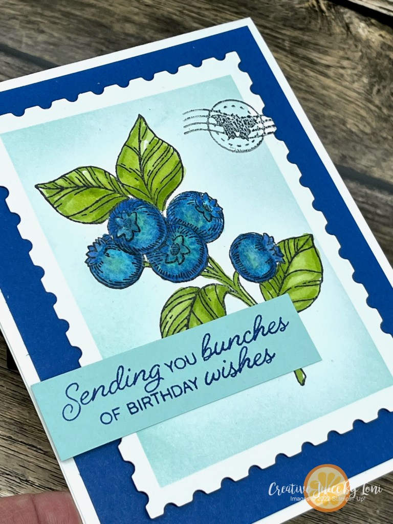
I admired the “Blueberry Bunches” stamp set (item #162692) the moment I saw it: It feels like a floral, but it’s a fruit, and that’s kinda my “jam” (see what I did there?).
I’ve paired the stamps with the Perennial Postage bundle (Item #162608) for the sentiment and postage stamp die (in various sizes).
This is the second largest die and after I cut a piece of basic white, I stamped the blueberries in the center, then used Masking Paper around the edges so I could blend Pool Party ink from the outside into the image- a technique called “Reverse Masking”. As you carefully peel off the masking paper, the background appears as a frame!
Once I colored the image with Stampin’ Blends alcohol markers, I “cancelled” the postage stamp with the cutest little detail of the cancellation mark, which I dipped into Memento Tuxedo black ink before running through the Stampin’ Cut & Emboss machine on top of my colored postage stamp.
Seemed fitting to share it with the #tgifc453 postal theme this week.
I’ll update the supply list once the catalog goes live, and hope you’ll try this technique and mail bunches of happy mail.
Need a Mini Catalog and Sale-a-Bration brochure? Shoot me a message and I’ll send it out to you.
Don’t want to miss a publication in the future? I mail mini catalogs to my customers who order $50 or more in the previous 6 months!
Very Vanilla is a warm option for basic stamping that is often overlooked, and our International design team is showing you how lovely it is paired with Crumb Cake (another neutral) to create timeless hand-stamped cards:
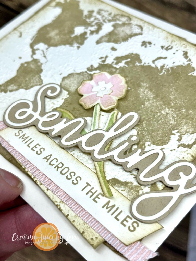
My “Sending Smiles Across the Miles” card begins with the Watercolor World background stamped with Crumb Cake on a 3-1/2″ x 4-3/4″ Very Vanilla card stock, then I embossed it with the Timeworn Type embossing folder. Add a bit of Crumb Cake ink with a blending brush lightly around the edges and layer it over a crumpled/distressed 3-3/4″ x 5″ crumb cake card stock.
💡 TIP: Spray the card stock you want to distress lightly with water in a Stampin’ Spritzer to make it easier to crumple in your hand, then lay it out flat to dry.
Wanting to keep the two colors as the main palette, I just added a subtle touch of Petal Pink and Soft Sea Foam on the flower/stem and ribbon.
Wouldn’t this be perfect to mail an international Pen Pal? Have you ever had a pen pal in another country? Let me know in the comments!
The card supplies are listed below the other hop participant’s links (visit them all and SAVE your favorites), and I’m delighted to serve you if you don’t have a preferred U.S. demonstrator!
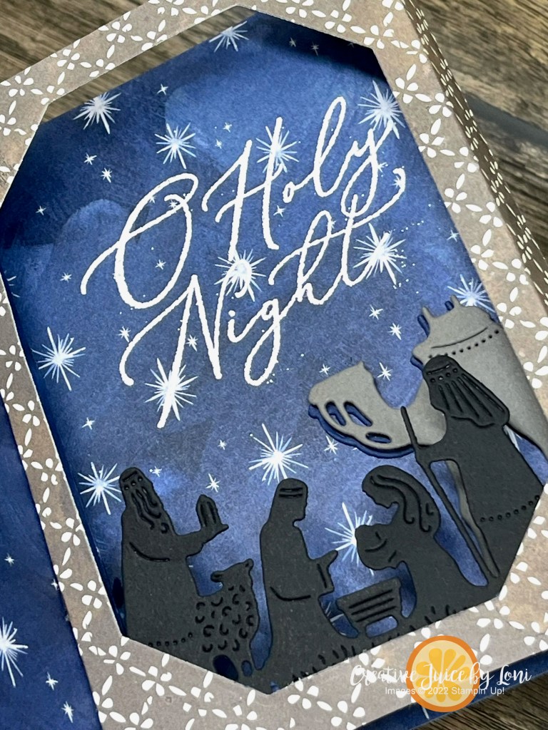
Do you have a favorite Christmas Carol or holiday tune? Mine is this one:
The TGIF Challenge #448 from Friday was to create a card inspired by a beloved piece of seasonal music~
I used “Come Lord Jesus” to create a card that could also be displayed as part of the true meaning of CHRISTmas:
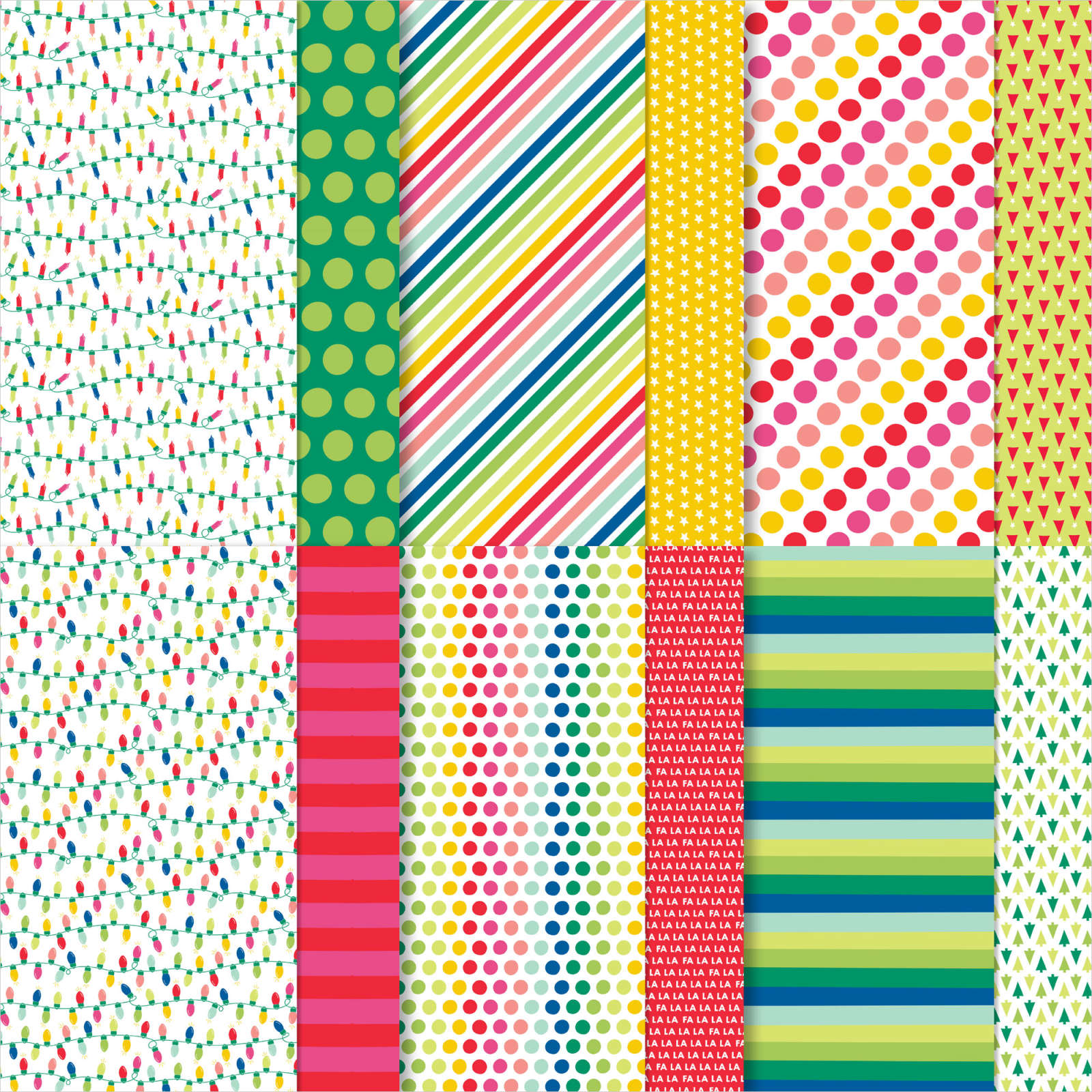
While I had prepared this card to demonstrate showing how to use the Night Divine bundlewith different Designer Series Paper (since the coordinating “O Holy Night” paper is sold out), sometime over the weekend, the “Joy of Christmas” Designer Series Paper that I used ALSO sold out during the Last Chance Sale…
THUS, I pivoted at the last minute and used patterns from the Joyful Specialty Designer Series Paper to demonstrate in my live video:
Card measurements:
Card base: 4.25″ x 11″, scored at 2, 3-3/8″, 7-5/8″ and 9″ along the long side.
Designer Series Paper for outside panels: Two pieces 4″ x 1-3/4″, (optional: two pieces 1-1/4″ x 4″ for the middle side panels, if you want it to pull all the way out).
Card stock for center (and/or back panel): 4″ square
If you were able to order the O Holy Night, I did make a version using that paper as well as an example:
I have two 6″x6″ Paper Shares left that have a sample of EVERY Designer Series Paper from the Sept-Dec mini catalog (EXCEPT the All About Autumn Designer Series Paper which sold out too fast). It is discounted to $25 (pick up) or you can pay shipping to you…first come, first served! Each pack DOES have a 6″ x 6″ piece of ALL the patterned papers on these nativity cards.
Thank you for allowing me to fuel your creativity! Here are the supplies used in the video:
Welcome to all our Stampin’ friends from around the world to our October New at SU! blog hop where we are hoping you see how a SKETCH can get your creative juices flowing for card making. We’ll show you our version of the sketch…then YOU try it, too!
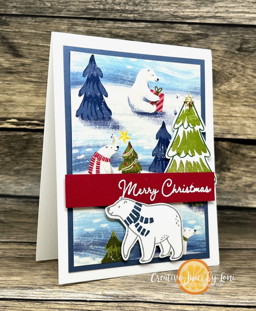
Don’t feel constrained to use the sketch in just one way. I turned it into landscape orientation for a second version, this time with a brown bear rather than a polar bear:
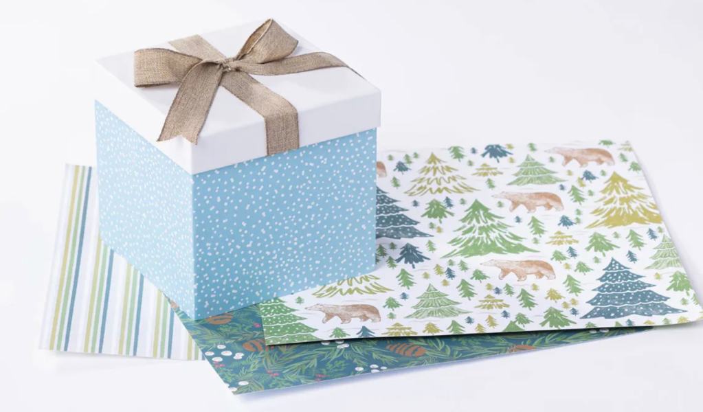
This landscape variation uses the same stamp set and punch with the “Walk in the Forest” Designer Series Paper, which is our MAKING A DIFFERENCE product. It coordinates with both the Beary Christmas suite AND the Merriest Trees bundle! For each package purchased in the USA*, Stampin’ Up! donates $3 to Marines Toys for Tots (*different amounts and charities are supported in different markets around the globe).
Even a simple card can have an unexpected bit of bling to catch the eye… each of my Beary Cute cards has a little sparkle! On the polar bear card, there is an gold star atop the tree (behind the sentiment) and on the brown bear card, it comes in the form of some glitter sequins (which are FLAT, so shouldn’t require extra postage) – both embellishments are included in the supply list below the Blog Hop links.
TIP: For the TREE with the brown bear, I turned my stamp upside down on my block and stamped off the Shaded Spruce ink one time before stamping the whole image over the dark details, like one of our Reversible stamp sets.
Have we inspired you to give this sketch a try? Tag us on social media with #newatsu so we can see your creativity!
If you haven’t seen all the other variations of this card sketch, click on any of our links for more inspiration:
October 2023 New at SU! Blog Hop: Sketch Challenge
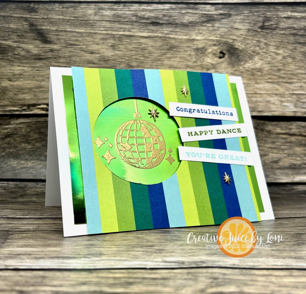
Inspired by the Global Design Project Sketch this week #GDP414 , I knew I wanted the disco ball from the Curved Occasions stamp set to be the focal point in the 2-3/8″ circle, and it needed bling, obviously, so I embossed it in gold on the foil sheet (remember to swipe the paper with the Embossing Buddy first, so you don’t get stray flecks)
More sparkle was added with Adhesive-Backed Star Trinkets which mimic the stars on the embossed image. It feels very RETRO with the bold stripes, too, yes? The Merry Bold & Bright Designer Series Paper isn’t just for holidays…in fact, I haven’t used any of it for Christmas yet and have almost been through an entire pack!
There are plenty of sentiments to choose from, so the 3 I used say, “Congratulations, Happy Dance, You’re Great!”
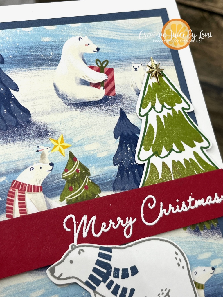
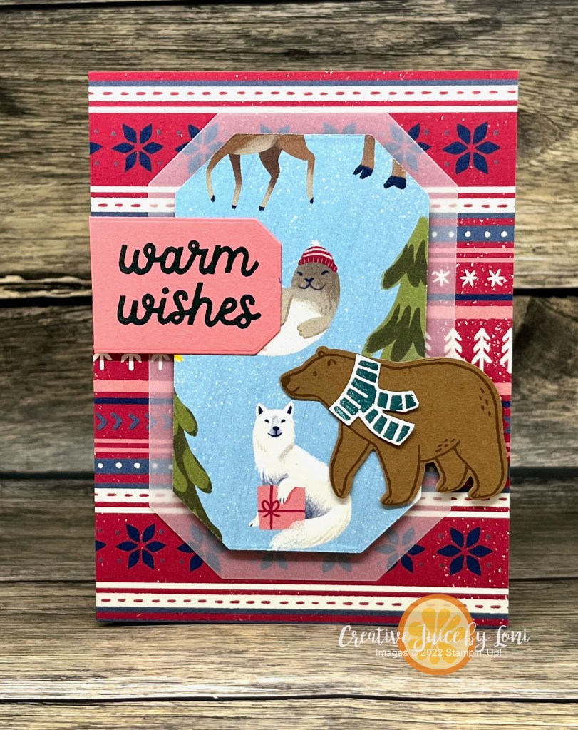
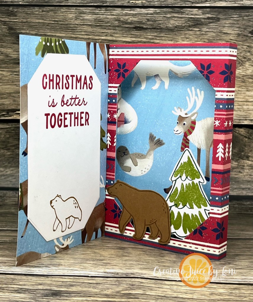
When there is a “scene” printed on Stampin’ Up! Designer Series Paper, it’s perfect for creating a framed picture that pops up inside your card!
For this one, I used the A Walk in the Forest DSP, which is part of our “Making A Difference” Campaign ($3 from each pack purchased is donated to the “Toys for Tots” program). This paper coordinates with both the Beary Christmas Suite and the Merriest trees bundle!
Here’s a slightly different version of the same card using the Beary Christmas paper included in the Beary Christmas Suite:
Because it was so much fun -and simple- to make (I’ll share a how-to video below), I had to make multiple versions with different Designer Series Paper from the September-December Mini Catalog. It’s like the One Card, Two Ways challenge from the #tgifc438 WWYD? Challenge:
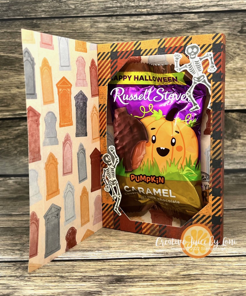
The design is roomy enough to sneak a treat inside (not a mailable option, obviously) and for this one I used Them Bones Designer Series Paper:
Sharp eyes may notice that the skeletons are smaller than those in the coordinating suite of Halloween products…because the stamp set I used was from the September 2019 Paper Pumpkin kit called “Bone Appetit”!
Before we get to the last version of the Interior Diorama card, here is the video tutorial:
The finished card (closed) is 4″ x 5-1/4″.
Begin with a 12″ x 5.25″ strip of Designer Series Paper and score at 1/2″, 4″, 4.5″ and 8″
I got all my paperwork caught up, so I’m rewarding myself with some stamping time and the Freshly Made Sketch 602 tempted me to give it a try:
Before I show you my card, let me ask a question: Do you look for a sketch to match the stamps you want to use -OR- do you find stamps to put into a sketch you found?
I’ve done both, but today it was sketch first, stamps next.
Wouldn’t this be a fun invitation for a New Year’s Eve Party? You can see how Amy O’Neill used the same sketch & stamps to make a birthday version here!
Bold stamps always appeal to me (no coloring required) and I thought the way you could “build” different party blowouts with the Year to Celebrate stamp set (NEW in the Sept-Dec mini catalog) was super cool:
I also love that the back side of many of the holiday Designer Series Papers are NON-HOLIDAY patterns, so they can be used all year long. The patterned paper I used on my card is the BACK SIDE of the Merry, Bold & Bright DSP that I GUARANTEE you are going to see a LOT of in the next few months!
The temperature fell almost 30 degrees overnight on Thursday night, with the arrival of a beautiful thunder/lightning show and rivers of rain! When you live in the desert, you don’t complain about water, and the cooler temperature is also welcome.
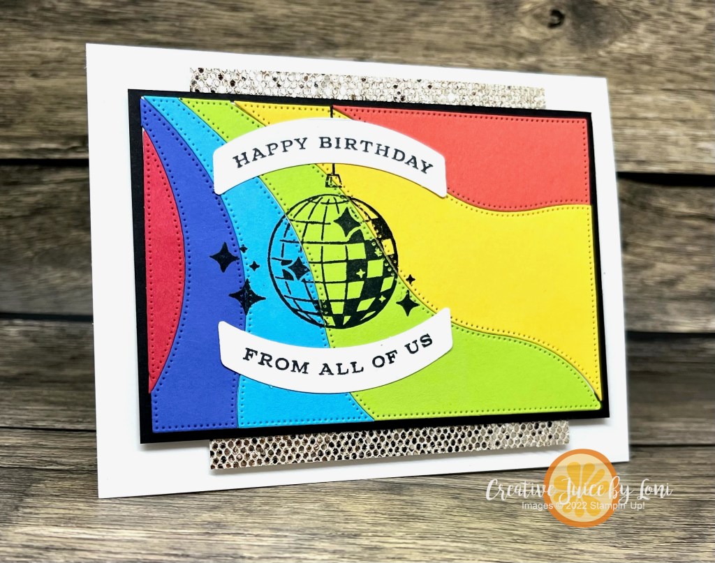
I’ve also been traveling a LOT, so I needed some time in my Stamp Studio and the Global Design Project #gdp409 challenge was the excuse I needed to bring a rainbow to a rainy day:
Roy G. Biv is the name to remember when you are putting colors in rainbow order (Red, Orange, Yellow, Green, Blue, Indigo, Violet) but they can circle back around on a card (not so much on a rainbow in the sky)…feel free to start ANYWHERE in the lineup!
My colors were (in ROYGBIV order, not the order on the first card) Sweet Sorbet, Calypso Coral, Daffodil Delight, Parakeet Party, Tahitian Tide and Orchid Oasis (allowing Orchid Oasis to be both Indigo and Violet).
The disco ball is from a new bundle coming September 6th called Curved Occasions in black. OF COURSE, it needed bling! The champagne More Dazzle specialty paper is JUST like a disco ball, and a little strip on the top and bottom catches the light and gets the party started.
I cut the wave pattern using the Patchwork Pieces dies from all the colors and laid them out to line them up on 6 backgrounds:
SHHH…Don’t tell anyone, but I was so excited with the first one I tried, I ended up going in a backward order, and then got a bit befuddled on a few that didn’t survive…a complete paper crafter predicament. That’s the way the card crumples.
There is also a roller skate in the set, so I stamped it on the second card, just to see if I liked it.
What do you think? With – or without – the skate?
Seems fitting to post this card today to remember my brother, Mike (1977-2022) on his birthday (September 2), with such iconic images from the 1970s. Speaking of a spectrum of colors, this photo is of my siblings in 2004 and you can see how genetics can produce light and dark skin! Mike is second from the right, and I’m on the other end. Grateful to know I will see him again after this life and was blessed to have a short time with him here. Be intentional and loving in your time with your family!
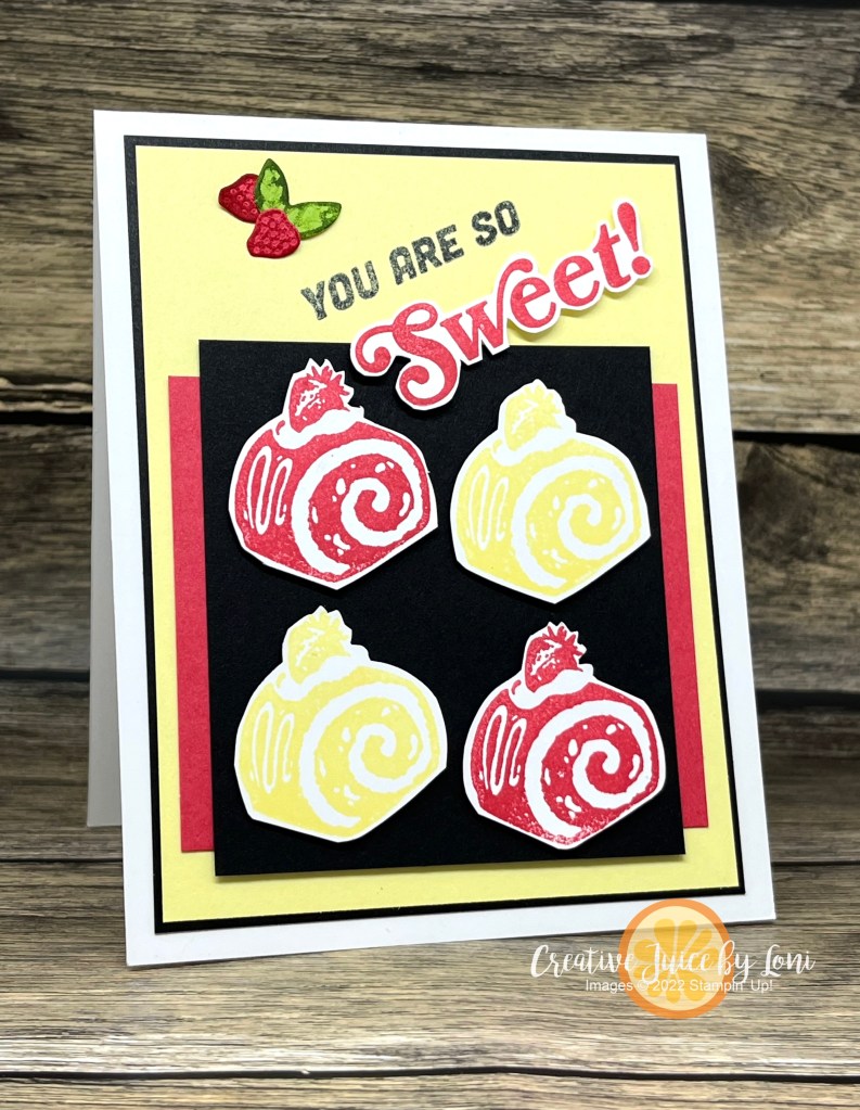
Friday is a good day for stretching those creative muscles, so I jumped into this unique TGIF Color Challenge!
Once I saw the colors, I went to my stamp collection to choose a stamp set. I hadn’t inked up the new SUPER COOL stamps yet, and the cake roll image reminded me of a red velvet cake:
It needed just a little something after I stamped (and fussy cut) the greeting, so I pulled out the teensy strawberry die from the So Refreshing dies to mimic the fruit on top of the cakes. Just “dip” them into an ink pad to really show off the texture from the dies…
It’s BONUS DAYS at Stampin’ Up!
Hope you make time to ink up a new stamp this weekend, too!

























 Creative Juice by Loni