While I’m coming to tell you all the super Stampin’ Up! stuff happening in August, stick around to the end for a Layering Leaves fun fold card that *doesn’t* require the Bough Punch!
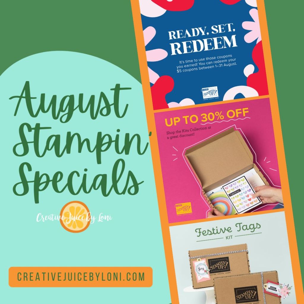
First, it’s TIME TO REDEEM the Bonus Days coupons you earned in July!

For each $50 you spent in July, you were emailed a coupon code for $5 off your next order. Find those emails/codes and enter/redeem them with your orders before August 31st.
Next: All Kits in the Kit Collection are DISCOUNTED up to 30% all month long!

That sale INCLUDES the NEWEST Kit, just released today: Festive Tags!

Sensational tags…and how cute on a kit! Stock up on both for holiday gift-giving now.
If you didn’t hear yesterday, my personal focus in August is on the Layering Leaves stamp set: This set coordinates with the Bough Punch – which is sadly being restocked from overseas – but you can still earn my 3 for FREE offer by adding the stamps to any $50+ order this month:

You’ll get a tutorial for 3 free cards via email AND the consumable supplies to make those 3 cards in the mail! I’ll also send any customer who orders the stamp set this month a FIRST NOTIFICATION message as soon as that pesky Bough Punch is back in stock, for you’ll want it with your stamp set.
There are just a few supplies you’ll need to complete the 3 free card tutorials that WON’T be included. You may already have these on hand OR could substitute similar products, but if you want to add them to your order, here they are:
Ink Pads: Basic Gray, Boho Blue, Moody Mauve, Wild Wheat, Copper Clay, Granny Apple and Tuxedo Black Memento Ink pad
Adhesive: Stampin’ Seal or Multipurpose Liquid Glue, Mini Glue Dots and Stampin’ Dimensionals
Meanwhile…

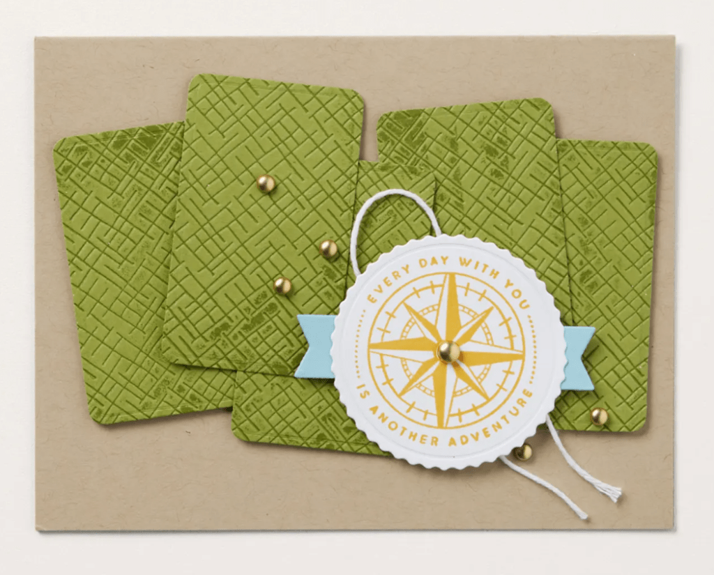
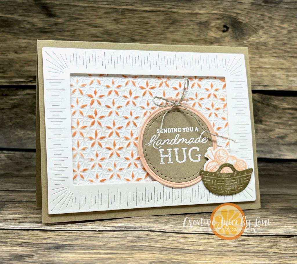
Here’s a simple fun fold card that you can create with your Layering Leaves stamp set!


")


 Woven Metallic Ribbon")


")


 Textured Ribbon")


 Satin Edged Ribbon")


")

 Designer Series Paper")


")


 Bordered Ribbon")


")