Understanding a COLOR WHEEL a little bit will help you put together beautiful color palettes for your stamping projects, and today we are talking about COMPLEMENTARY colors, or colors directly across from each other on the color wheel:

When you choose complementary colors, you create HIGH ENERGY in a palette, like this turtle card made from the Playing in the Rain stamp set from Stampin’ Up! using Azure Afternoon (blue) and Pumpkin Pie (orange):

You can always add a bit of a third color (in this case, Granny Apple Green) and still keep the two main colors in focus!
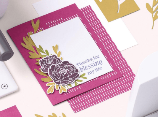
One thing I love doing with a new catalog is to look for card layouts I can copy. Both of the cards I am sharing today were inspired by this card on page 152 of the annual catalog (154 in the digital version):

This next complementary color card follows the same pattern or card layout, but uses the LOVELY new Lemon Lolly color paired with Fresh Freesia, which I cannot get enough of:

This time I used the Sweet Citrus stamps and dies (my signature for creative juice) and embossed the front panel with the Raindrops embossing folder after I stamped the greeting.
All of this is shared in my weekly video, and if you are like me and want it to play faster, just speed up the playback by clicking on the gear at the bottom of the YouTube video!
Now you know a little more about complementary colors, try it yourself! Find a card design in the catalog (or use one of my previous samples here on CJBL) and re-create it with your own colors and stamps.
If you want to copy one of the cards I shared today, here are the supplies I used for both cards:
Product List
I appreciate the opportunity to serve your creative needs! Make time to stamp and find your happy place.


