This card was inspired by a card created by German Demonstrator Madeleine Mrotzek for the #gdp364 challenge:
I turned the slimline card on the side (3.5″ x 6.25″) and used the Stamparatus to get perfect placement: Just take out the plate with the stamp on it and move it down to the next hinge, then ink up your stamp with a different color (watch video, top).
It’s a fast & fabulous technique to try in your craft room! Don’t forget to stamp the envelope, too!
It seems funny to be stamping an autumn card in a record-breaking heat wave (111° in Southern Utah today), but like Pumpkin Spice season, you can’t stop me from showing up in hopes that the fall weather will catch up to my crafting. Besides, Fall is also the theme for the Global Design Project #gdp359 and it gives you time to add these seasonal items in time for your fall crafting.
My card started with the Leaf Fall 3-D embossing folder on a piece of Very Vanilla card stock:Using sponge daubers to add ink from an ink pad to an embossed (raised) image gives a messy, windblown feeling, even if it’s not happening outside…yet.
Alternately, you could color the leaves with Stampin’ Blends alcohol markers:
Because leaves are individually “one-of-a-kind”, I used a sentiment from the the August Paper Pumpkin kit on my Leaf Label. ***Remember to look through the stamps from your past kits*** when you need the perfect greeting! (Not yet a subscriber for monthly craft kits from Paper Pumpkin? Try it– you’ll love how fun and easy they are to assemble by yourself or with a friend.)
Back to the Leaf Fall embossing folder: Don’t limit yourself to fall colors! Look at how lovely the leaves look colored in Flirty Flamingo, Mint Macaron, Old Olive, Petal Pink, and Soft Succulent Stampin’ Blends, then cut out and grouped on a card:
So which will you try? Sponging or coloring your embossed images with Stampin’ Blends?
Since I’ve been on vacation for a few weeks, I woke up so excited to get back into my craft room and do a LIVE stamping video on my Facebook page today at lunchtime, and I was able to MULTI-CRAFT for a few occasions: My parent’s 58th Anniversary, to show you a wonderful Sale-a-Bration stamp set AND to participate in the Global Design Project Theme Challenge #GDP351 about SHAPES:
I pulled out the Watercolor Shapes stamp set to create my own patterned paper on a full sheet of white card stock using Fresh Freesia, Soft Sea Foam, Pale Papaya and Pool Party ink pads. Next, I cut the paper into 7 different pieces and layered them on card bases, then I stamped the greetings from the Amazing Phrasing stamp set you could choose as your Sale-a-Bration freebie (with a $100 US order). To give them a bit of bling, I added sparkly Adhesive-Backed Sequins & Gems.
You can watch the full tutorial (and fast forward through me talking) on my Creative Juice by Loni Facebook page HERE because I don’t have time to edit it for YouTube today.
Seven cards from one sheet of patterned paper:
Then I finished one more with a layer of black card stock:
How clever is it to use the gems & rhinestones to create a little exclamation point?!
During Sale-a-Bration you earn free craft supplies when you shop, host a party (yes, I do virtual parties too!) or join my team (and if you are buying more than $99 anyway, the starter kit is the best deal!)
Cody and I recently returned from a 6+ week road trip back to see our kids and grandkids in Maryland. He joked that we planned to drive out together, but if things didn’t go well, one of us could fly home 😂 Luckily, we did remarkably well, and enjoyed discovering so many amazing places across the US:
It seems fitting for our relationship that he’s the person I love to “get lost” with– but with him, I’m home.
This week’s #gdp346 sketch from the Global Design Project blog was perfect for a card I’m going to save for our Anniversary:
Cody teases me that “every day is an adventure” together, so the compass stamp was fitting. I LOVE the die cut pieces in the Designer Series Paper and I used one of them as the focal point.
The saying, “Imitation is the sincerest form of flattery” is true for the card I created today, inspired by a card from demonstrator Charlet Mallett on the Global Design Project #344:
I really loved her watercolored image and knowing that some of you are intimidated by watercoloring, I wanted to make it really simple. This is simple enough that ANYONE could do it:
I stamped the flower image from the Blessings of Home stamp set in opposite corners of a 3-1/2″ x 4-3/4″ piece of Watercolor paper (the key to a beautiful watercolored background), then used ink pads from the Subtles color family as my palette to pick up the color (from the inside of the lid, see example here) using Water Painters.
What I love about watercoloring is: It’s MESSY and BEAUTIFUL!
TIP: Keep a piece of scratch paper and a paper towel at hand to “practice” on and wipe off your Water Painter when you move to a new color…just squeeze the barrel to run the water and wipe the brush until no color transfers to the towel.
Mounted on a piece of Basic White card stock as a frame (3-3/4″ x 5″) and then attached to the front of a Pool Party card base, it’s a simple card that makes you feel like Picasso and the sentiment embossed in white on black card stock really stands out against the watercolored background.
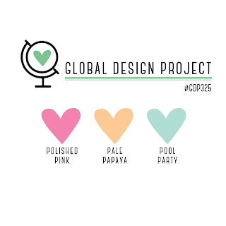
The Global Design Project color challenge was just too cute to pass up:
They look like a scoop of sherbet, so I grabbed my Sweet Ice Cream stamp set and made a floating frame card that would be yummy for Valentine’s Day, too:
The first idea that came to mind was a shaker card when I saw the #tgifc342 sketch, and the second idea was that it would be lovely in the #gdp317 color challenge:
I am participating in Stampin’ Up!’s virtual convention #onstageathome so as I was listening to a class, I had time to put my ideas to paper, so to speak!
I used Faux Snow from Dollar Tree inside my shaker and colored the white seam binding ribbon with my dark Mint Macaron Stampin’ Blend marker. Sometimes you have to pull pieces from multiple stamp sets to create what you imagined in your head, so the. sentiment is from the Banner Year stamp set (all supplies listed below) and stars came from the beloved Seasons of Fun set (remember to choose it as part of your host rewards when your order is over $150).
A heartfelt THANK YOU to all my stamping friends who have supported my business. I earned the following awards this year and it’s all courtesy of your friendship and loyalty. YOU are the best reward I could ever ask for!
I gave my Sprinkled Ink Team the challenge to create a project using a color palette including a 2021-2023 In Color and this is the card I came up with (because you can’t ask your team to do something you aren’t willing to do)!
You know I love to combine a few challenges, so I borrowed some inspiration from the Global Design Project “Case the Designer” theme this week, where Emma Goddard’s card was a great starting point:
I flipped the black & white vs colored strip around so I could teach how to do the emboss resist technique: It’s an easy WOW that makes any card irresistible (see what I did there?).
To do this, you simply need to emboss your image in white or clear embossing powder onto white card stock, then blend ink over your embossed images~ the embossed images resist the ink and appear magically!
Watch HOW here:
Remember: When you buy the Dragonfly Garden BUNDLE (stamps + punch) from my Stampin’ Store in June, you get 3 free projects in the mail! Consider this card a bonus idea 🙂
Looking for creative palettes using In Colors? Download the In Color Coach .pdf for the current 10 In Colors below!
While I’m a native southwestern girl, I confess I’m not really into southwestern decor. However, the Flowering Cactus Product Medley caught my attention in the Jan-June Catalog with a fresh palette and adorable images and fonts that really made me want to play with it.
Enter the #GDP293 color challenge with 3 new In Colors, and they’ve got me reaching for that Flowering Cactus…
While stamping the background, it’s not going to look good until you are almost finished stamping…don’t worry if it looks a mess, it will all work out fine!
This is the type of card you have to intentionally mail: Can you think of a friendship that has become richer through the years because you’ve been through a lot of “sticky” situations and “dry” seasons? Write down those memories and be grateful that you are closer because of them.
Don’t miss the chance to add the Flowering Cactus Product Medley to your stamping stash: It retires in June!
Yesterday was a tragic comedy at my house: In an attempt to help, my son updated the OS on my MacBook…and the result was that I lost everything. That was just the beginning of my trauma, but I won’t bore you with how I ended up crying myself to sleep in the parking lot of Simply Mac as they reset my computer to factory settings.
Those days happen to everyone.
When things like this happen, I remind myself that I wouldn’t recognize happiness if I wasn’t familiar with misery. T The scripture that was on repeat in my head yesterday was from Doctrine & Covenants 29:39: “…if they never should have bitter they could not know the sweet” (The D&C is a collection of modern day revelations from the Church of Jesus Christ of Latter Day Saints) I’m just grateful that the sun rose this morning and I can start again!
One GOOD thing that happened while I was on the phone for 4 hours with Apple yesterday: I got to stamp a card for the Global Design Project Color Challenge #GDP289
This color combination made me smile when I saw it and the first set that came to mind was my beloved Cute Fruit stamp set that is retiring next week.
Just like the fruit on the card, I had to stamp on a happy face for the day and keep moving forward.
Lesson to be learned: When technology fails, we’ll always be able to STAMP!