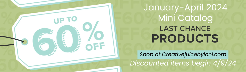
As we near the end of a Stampin’ Up! catalog year, it’s time to spotlight some of my favorite retiring products. These products are available while supplies last or until April 30, 2024 (download full retiring product list at end of this post).
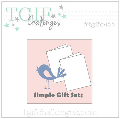
Since the TGIF Bonus Challenge #tgifc466 was to create a “simple gift set” of cards, it gave me the opportunity to stretch outside my comfort zone of bright colors, and use some of the black & white designs from the Delightfully Eclectic Designer Series Paper. But you can’t take ALL the color out of my life, so I added Calypso Coral, which also shows up on some of the paper designs.


These cards use the paper, PLUS the Good Feelings stamp set and Rays of Light background stamp, all of which will NOT be returning to the new catalog premiering in May. The Rays of Light background is the one I will grieve over losing the most!

This simple fun-fold card style is strategically planned to make the most of your patterned paper! If you score a full 8.5″ x 11″ sheet of card stock along the long edge at 4.25″ and 9.75″…THEN cut it in half at 4.25″, you’ll have two 11″ x 4.25″ cards ready to fold, meeting on the front of the card,
Use a 4″ x 4″ piece of DSP on one side and a 4″ x 1″ piece on the smaller fold. This pattern can be used in landscape or portrait orientation.

Now, HOW should we “gift” all these simple co-ordinating cards?

A quick folio made from a 12″ tall x 10″ wide piece of the Designer Series Paper is just the thing, and can hold all the cards plus envelopes!
Score it at 4.75″ and 5.25″ to give a center binding back, then add a ribbon to tie closed:


What else is retiring? Click banners to download the lists of items from the ’23-’24 Annual Catalog AND the January-April Mini Catalog which will be retiring.
>>> NOTE THAT THE LAST CHANCE SALE STARTS APRIL 9th <<<

These are the supplies I used for my simple set of cards and the folio to gift them in. I appreciate your orders so much and will mail you a thank you card! THANK YOU.
Product List")

 Designer Series Paper")


 Gingham Ribbon")


")


")
")


