A couplet in honor of the circle punch:
“O steadfast circle punch, quiet hero of the craft,
You press into the spotlight with a single, perfect draft.”
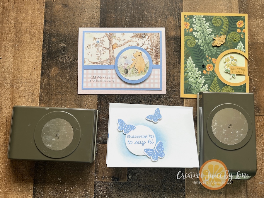
Of all the paper punches I own, the CIRCLE is the one that I reach for the most often. It’s simply a tool that every paper crafter must have on hand, and the only thing better than one circle punch is TWO!
Today I shared a three card ideas using a circle punch, along with a few paper crafting tips that will help you become a better creator in my LIVE CRAFTING VIDEO:
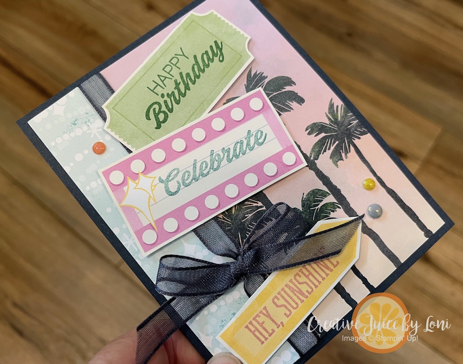
This is the card guests stamped at my Catalog Carnival Open house over the weekend, and it’s so simple to make by using the 1-3/4″ Circle Punch for the sentiment. The butterflies are stamped and cut out with the All Aflutter punch that drops tomorrow in my Stampin’ Store:
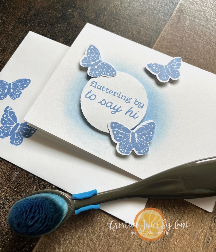
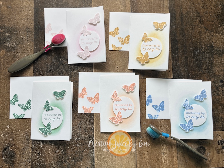
Hydrangea Hue (the color of the butterfly card) is a NEW 2026-2028 In Color, and I showed the new ink pad case in the video, which I KNOW you are going to obsess over both the pads & colors, so I made this notecard in every color (clockwise from top left: Barely Blush, Golden Glow, Hydrangea Hue, Crisp Cantaloupe and Peaceful Pine):
SIDE NOTE: Join my team in May 2026 and you’ll get all 5 of these In Color Stamp Pads in your Starter Kit FREE!
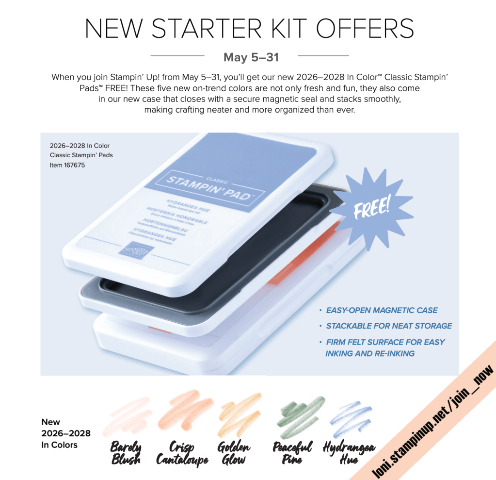
Don’t need ink? You can choose an additional $35 worth of products for your Starter Kit instead. That’s $160 worth of products for only $99!
Circling back to our circle punch projects, the next card I demonstrated was the “Old Friends are the Best Friends” card featuring the Silly Old Bear Designer Series Paper and more of the new In Colors. This one layered the 2″ circle (Pooh & Piglet) over the 2-3/4″ circle punch:
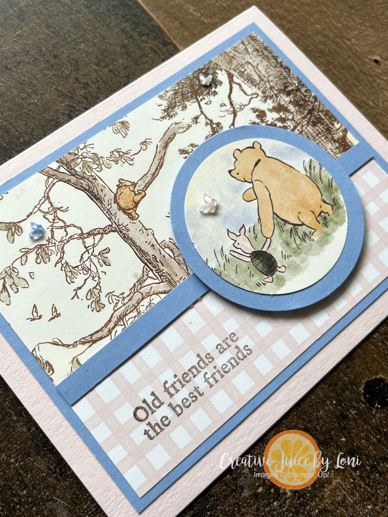
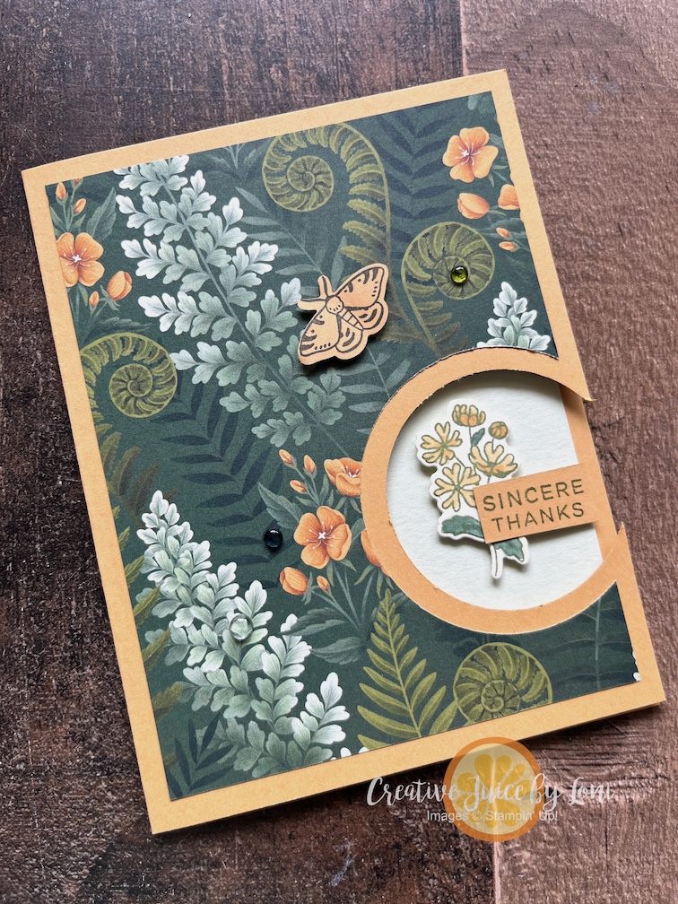
And the last card was a “Golden Glow”up of the Moonlit Flora suite as a peek-through card – you’ll want to watch to see how this one is done in the easiest way:
This is NOT a comprehensive list of ways to use the Stampin’ Up!®️ circle punches, only the very beginning! Check back often this month for MORE sensational stamping with circles as we launch our May products starting May 5th.
Both Silly Old Bear and Moonlit Flora Designer Series Paper is included in the Creative Juice Paper Share and tomorrow (May 5th) is the deadline to reserve your share.



![Nature Walk 12" X 12" (30.5 X 30.5 Cm) Designer Series Paper [ 166912 ] Nature Walk 12" X 12" (30.5 X 30.5 Cm) Designer Series Paper [ 166912 ]](https://assets1.tamsnetwork.com/images/EC042017NF/166912s.jpg)
![Secret Sea 8 1/2" X 11" Cardstock [ 165624 ] Secret Sea 8 1/2" X 11" Cardstock [ 165624 ]](https://assets1.tamsnetwork.com/images/EC042017NF/165624s.jpg)
![Cajun Craze 8-1/2" X 11" Cardstock [ 119684 ] Cajun Craze 8-1/2" X 11" Cardstock [ 119684 ]](https://assets1.tamsnetwork.com/images/EC042017NF/119684s.jpg)
![Adhesive Sheets [ 152334 ] Adhesive Sheets [ 152334 ]](https://assets1.tamsnetwork.com/images/EC042017NF/152334s.jpg)
![Alphabet à La Mode Dies [ 160750 ] Alphabet à La Mode Dies [ 160750 ]](https://assets1.tamsnetwork.com/images/EC042017NF/160750s.jpg)
![Mini Stampin' Cut & Emboss Machine [ 150673 ] Mini Stampin' Cut & Emboss Machine [ 150673 ]](https://assets1.tamsnetwork.com/images/EC042017NF/150673s.jpg)
![2025–2027 In Color™ Flat Pearls [ 165192 ] 2025–2027 In Color™ Flat Pearls [ 165192 ]](https://assets1.tamsnetwork.com/images/EC042017NF/165192s.jpg)

![Lovely Arrangements Bundle (English) [ 167176 ] Lovely Arrangements Bundle (English) [ 167176 ]](https://assets1.tamsnetwork.com/images/EC042017NF/167176s.jpg)
![Reason To Celebrate Photopolymer Stamp Set (English) [ 166905 ] Reason To Celebrate Photopolymer Stamp Set (English) [ 166905 ]](https://assets1.tamsnetwork.com/images/EC042017NF/166905s.jpg)
![Eyelet Blooms Die [ 167984 ] Eyelet Blooms Die [ 167984 ]](https://assets1.tamsnetwork.com/images/EC042017NF/167984s.jpg)
![Basic Beige 8 1/2" X 11" Cardstock [ 164511 ] Basic Beige 8 1/2" X 11" Cardstock [ 164511 ]](https://assets1.tamsnetwork.com/images/EC042017NF/164511s.jpg)
![Basic White 8 1/2" X 11" Cardstock [ 166780 ] Basic White 8 1/2" X 11" Cardstock [ 166780 ]](https://assets1.tamsnetwork.com/images/EC042017NF/166780s.jpg)
![Basic Beige Classic Stampin Pad [ 163806 ] Basic Beige Classic Stampin Pad [ 163806 ]](https://assets1.tamsnetwork.com/images/EC042017NF/163806s.jpg)
![Flat Adhesive Backed Pearls [ 160449 ] Flat Adhesive Backed Pearls [ 160449 ]](https://assets1.tamsnetwork.com/images/EC042017NF/160449s.jpg)
![Stampin' Cut & Emboss Machine [ 149653 ] Stampin' Cut & Emboss Machine [ 149653 ]](https://assets1.tamsnetwork.com/images/EC042017NF/149653s.jpg)
![Stampin' Seal [ 152813 ] Stampin' Seal [ 152813 ]](https://assets1.tamsnetwork.com/images/EC042017NF/152813s.jpg)
![Stampin' Dimensionals [ 104430 ] Stampin' Dimensionals [ 104430 ]](https://assets1.tamsnetwork.com/images/EC042017NF/104430s.jpg)




![Woolly Friends Bundle (English) [ 166888 ] Woolly Friends Bundle (English) [ 166888 ]](https://assets1.tamsnetwork.com/images/EC042017NF/166888s.jpg)
![Mixed Up Patterns 12" X 12" (30.5 X 30.5 Cm) Mix In Designer Series Paper [ 166992 ] Mixed Up Patterns 12" X 12" (30.5 X 30.5 Cm) Mix In Designer Series Paper [ 166992 ]](https://assets1.tamsnetwork.com/images/EC042017NF/166992s.jpg)
![Daffodil Delight 8-1/2" X 11" Cardstock [ 119683 ] Daffodil Delight 8-1/2" X 11" Cardstock [ 119683 ]](https://assets1.tamsnetwork.com/images/EC042017NF/119683s.jpg)
![Garden Green 8-1/2" X 11" Cardstock [ 102584 ] Garden Green 8-1/2" X 11" Cardstock [ 102584 ]](https://assets1.tamsnetwork.com/images/EC042017NF/102584s.jpg)
![Flirty Flamingo 8-1/2" X 11" Cardstock [ 141416 ] Flirty Flamingo 8-1/2" X 11" Cardstock [ 141416 ]](https://assets1.tamsnetwork.com/images/EC042017NF/141416s.jpg)
![Lemon Lolly 8 1/2" X 11" Cardstock [ 161720 ] Lemon Lolly 8 1/2" X 11" Cardstock [ 161720 ]](https://assets1.tamsnetwork.com/images/EC042017NF/161720s.jpg)
![Smoky Slate 8-1/2" X 11" Cardstock [ 131202 ] Smoky Slate 8-1/2" X 11" Cardstock [ 131202 ]](https://assets1.tamsnetwork.com/images/EC042017NF/131202s.jpg)
![Daffodil Delight Classic Stampin' Pad [ 147094 ] Daffodil Delight Classic Stampin' Pad [ 147094 ]](https://assets1.tamsnetwork.com/images/EC042017NF/147094s.jpg)
![Garden Green Classic Stampin' Pad [ 147089 ] Garden Green Classic Stampin' Pad [ 147089 ]](https://assets1.tamsnetwork.com/images/EC042017NF/147089s.jpg)
![Flirty Flamingo Classic Stampin' Pad [ 147052 ] Flirty Flamingo Classic Stampin' Pad [ 147052 ]](https://assets1.tamsnetwork.com/images/EC042017NF/147052s.jpg)
![Smoky Slate Classic Stampin' Pad [ 147113 ] Smoky Slate Classic Stampin' Pad [ 147113 ]](https://assets1.tamsnetwork.com/images/EC042017NF/147113s.jpg)
![Paper Trimmer [ 152392 ] Paper Trimmer [ 152392 ]](https://assets1.tamsnetwork.com/images/EC042017NF/152392s.jpg)
![Hole Punch Assortment [ 165409 ] Hole Punch Assortment [ 165409 ]](https://assets1.tamsnetwork.com/images/EC042017NF/165409s.jpg)
![Garden Green 1/8" (3.2 Mm) Chevron Ribbon [ 167212 ] Garden Green 1/8" (3.2 Mm) Chevron Ribbon [ 167212 ]](https://assets1.tamsnetwork.com/images/EC042017NF/167212s.jpg)
![Brushed Brass Butterflies [ 158136 ] Brushed Brass Butterflies [ 158136 ]](https://assets1.tamsnetwork.com/images/EC042017NF/158136s.jpg)
![Blending Brushes [ 153611 ] Blending Brushes [ 153611 ]](https://assets1.tamsnetwork.com/images/EC042017NF/153611s.jpg)
![Foam Adhesive Strips [ 141825 ] Foam Adhesive Strips [ 141825 ]](https://assets1.tamsnetwork.com/images/EC042017NF/141825s.jpg)


![Filled With Sweetness Bundle (English) [ 167475 ] Filled With Sweetness Bundle (English) [ 167475 ]](https://assets1.tamsnetwork.com/images/EC042017NF/167475s.jpg)
![Homemade Sweetness 12" X 12" (30.5 X 30.5 Cm) Designer Series Paper [ 167467 ] Homemade Sweetness 12" X 12" (30.5 X 30.5 Cm) Designer Series Paper [ 167467 ]](https://assets1.tamsnetwork.com/images/EC042017NF/167467s.jpg)
![Misty Moonlight 8-1/2" X 11" Cardstock [ 153081 ] Misty Moonlight 8-1/2" X 11" Cardstock [ 153081 ]](https://assets1.tamsnetwork.com/images/EC042017NF/153081s.jpg)
![Strawberry Slush 8 1/2" X 11" Cardstock [ 165625 ] Strawberry Slush 8 1/2" X 11" Cardstock [ 165625 ]](https://assets1.tamsnetwork.com/images/EC042017NF/165625s.jpg)
![3" X 3" (7.6 X 7.6 Cm) Flip Flaps [ 166514 ] 3" X 3" (7.6 X 7.6 Cm) Flip Flaps [ 166514 ]](https://assets1.tamsnetwork.com/images/EC042017NF/166514s.jpg)
![Secret Sea Classic Stampin' Pad [ 165285 ] Secret Sea Classic Stampin' Pad [ 165285 ]](https://assets1.tamsnetwork.com/images/EC042017NF/165285s.jpg)
![Misty Moonlight Classic Stampin' Pad [ 153118 ] Misty Moonlight Classic Stampin' Pad [ 153118 ]](https://assets1.tamsnetwork.com/images/EC042017NF/153118s.jpg)
![Strawberry Slush Classic Stampin' Pad [ 165286 ] Strawberry Slush Classic Stampin' Pad [ 165286 ]](https://assets1.tamsnetwork.com/images/EC042017NF/165286s.jpg)
![Tear & Tape Adhesive [ 154031 ] Tear & Tape Adhesive [ 154031 ]](https://assets1.tamsnetwork.com/images/EC042017NF/154031s.jpg)
![Multipurpose Liquid Glue [ 110755 ] Multipurpose Liquid Glue [ 110755 ]](https://assets1.tamsnetwork.com/images/EC042017NF/110755s.jpg)





![Boardwalk Fun Photopolymer Stamp Set (English) [ 166822 ] Boardwalk Fun Photopolymer Stamp Set (English) [ 166822 ]](https://assets1.tamsnetwork.com/images/EC042017NF/166822s.jpg)
![Beach Boardwalk 12" X 12" (30.5 X 30.5 Cm) Designer Series Paper [ 166820 ] Beach Boardwalk 12" X 12" (30.5 X 30.5 Cm) Designer Series Paper [ 166820 ]](https://assets1.tamsnetwork.com/images/EC042017NF/166820s.jpg)
![2024 2026 In Color™ Flat Pearls [ 165266 ] 2024 2026 In Color™ Flat Pearls [ 165266 ]](https://assets1.tamsnetwork.com/images/EC042017NF/165266s.jpg)
![Secret Sea 3/8" (1 Cm) Bordered Open Weave Ribbon [ 166932 ] Secret Sea 3/8" (1 Cm) Bordered Open Weave Ribbon [ 166932 ]](https://assets1.tamsnetwork.com/images/EC042017NF/166932s.jpg)
![Fresh Freesia Classic Stampin' Pad [ 155611 ] Fresh Freesia Classic Stampin' Pad [ 155611 ]](https://assets1.tamsnetwork.com/images/EC042017NF/155611s.jpg)
![Lost Lagoon Classic Stampin' Pad [ 161678 ] Lost Lagoon Classic Stampin' Pad [ 161678 ]](https://assets1.tamsnetwork.com/images/EC042017NF/161678s.jpg)
![Pretty Peacock Classic Stampin’ Pad [ 150083 ] Pretty Peacock Classic Stampin’ Pad [ 150083 ]](https://assets1.tamsnetwork.com/images/EC042017NF/150083s.jpg)


![Boardwalk Fun Bundle (English) [ 166829 ] Boardwalk Fun Bundle (English) [ 166829 ]](https://assets1.tamsnetwork.com/images/EC042017NF/166829s.jpg)
![Blueberry Bushel 8-1/2" X 11" Cardstock [ 146968 ] Blueberry Bushel 8-1/2" X 11" Cardstock [ 146968 ]](https://assets1.tamsnetwork.com/images/EC042017NF/146968s.jpg)
![Pool Party 8-1/2" X 11" Cardstock [ 122924 ] Pool Party 8-1/2" X 11" Cardstock [ 122924 ]](https://assets1.tamsnetwork.com/images/EC042017NF/122924s.jpg)
![Coastal Cabana 8-1/2" X 11" Cardstock [ 131297 ] Coastal Cabana 8-1/2" X 11" Cardstock [ 131297 ]](https://assets1.tamsnetwork.com/images/EC042017NF/131297s.jpg)
![Strawberry Slush 8-1/2" X 11" Card Stock [ 131295 ] (Retired) Strawberry Slush 8-1/2" X 11" Card Stock [ 131295 ] (Retired)](https://assets1.tamsnetwork.com/images/EC042017NF/131295s.jpg)
![Lemon Lime Twist 8-1/2" X 11" Cardstock [ 144245 ] Lemon Lime Twist 8-1/2" X 11" Cardstock [ 144245 ]](https://assets1.tamsnetwork.com/images/EC042017NF/144245s.jpg)
![Blueberry Bushel Classic Stampin' Pad [ 147138 ] Blueberry Bushel Classic Stampin' Pad [ 147138 ]](https://assets1.tamsnetwork.com/images/EC042017NF/147138s.jpg)
![Lemon Lime Twist Classic Stampin' Pad [ 147145 ] Lemon Lime Twist Classic Stampin' Pad [ 147145 ]](https://assets1.tamsnetwork.com/images/EC042017NF/147145s.jpg)
![Basic Black 8-1/2" X 11" Cardstock [ 121045 ] Basic Black 8-1/2" X 11" Cardstock [ 121045 ]](https://assets1.tamsnetwork.com/images/EC042017NF/121045s.jpg)
![2024–2026 In Color™ 8 1/2" X 11" Cardstock [ 163803 ] 2024–2026 In Color™ 8 1/2" X 11" Cardstock [ 163803 ]](https://assets1.tamsnetwork.com/images/EC042017NF/163803s.jpg)
![Tuxedo Black Memento Ink Pad [ 132708 ] Tuxedo Black Memento Ink Pad [ 132708 ]](https://assets1.tamsnetwork.com/images/EC042017NF/132708s.jpg)
![Black Stampin' Dimensionals Combo Pack [ 150893 ] Black Stampin' Dimensionals Combo Pack [ 150893 ]](https://assets1.tamsnetwork.com/images/EC042017NF/150893s.jpg)
![Take Your Pick [ 144107 ] Take Your Pick [ 144107 ]](https://assets1.tamsnetwork.com/images/EC042017NF/144107s.jpg)
